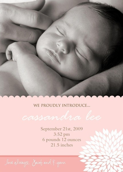
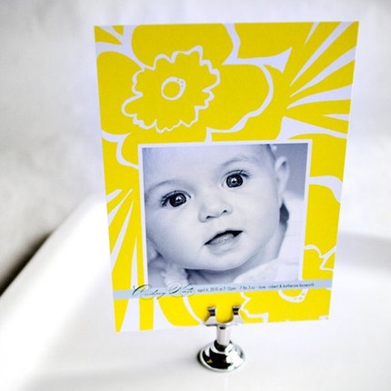
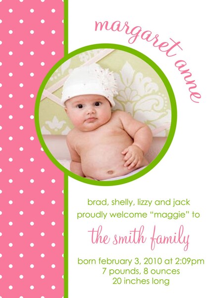
I was surprised to find that I had a harder time finding girl announcements that I liked. I would have thought this would have been sooo much easier- girl stuff is so much cuter in general, I thought. For whatever reason, this time the boy search was much easier. Maybe I'm just pickier about girly stuff in general. Maybe it's because I couldn't find as many monograms. Or maybe puddin' is a boy? Hmmmmmm.......
Again, as yesterday, let me know which is your favorite and which you really don't like!!
Or, if any of you have found any wonderful baby girl announcements (or other sites I can peruse), PLEASE let me know. As I look over these again, I'm not sure I'm madly in love with any of them..........


Ohmygosh. I can't even choose this time...all of the options are unbelievably cute!!! (PS - seems like baby announcements offer some good name suggestions too!)
ReplyDelete6, 8 and the last one!
ReplyDeleteDid I tell you that my parents 1st dog right when they got married was named Puddin'? She was a tiny little Yorkie...So cute...
Baby posts are so fun! I *usually* prefer clean, classic, traditional style announcements. {I kind of feel it's like your wedding dress. Go with something classic and timeless for the dress because you can always wear something trendy to a dinner party later just like you can always get a mod or funky bday party invite in the years to come depending on what's popular}. But that's just me.
ReplyDeleteAll that being said, I really love that yellow one, too. I know it's not what I just described, but I really do love it. So far it's my favorite of your options for introducing your little ray of sunshine. I also think Lindsay and Gabriella's announcements are great.
The best announcement I've ever seen was a very simple rectangular card that was only a few inches long. It had a simple pink bow on the front and the baby's name in a beautiful pink font. The back had the weight information and the parents' names. It was very simple with no photo or border or anything, but it was really fantastic. Sorry I don't have a photo of it.
My favorite is the square Tiny Prints one with the green border and pink polka dots in each of the corners- adorable!
ReplyDeleteThese are all so cute! What a difficult decision. I really adore the yellow one because it's so bright and happy. I'm sure whichever one you choose will be perfect, though. They're all great!
ReplyDelete